What a Good Client-Facing Site Health Report Looks Like
A practical guide for agencies to turn monitoring data into clear site health reports that build trust, justify retainers, and drive action.
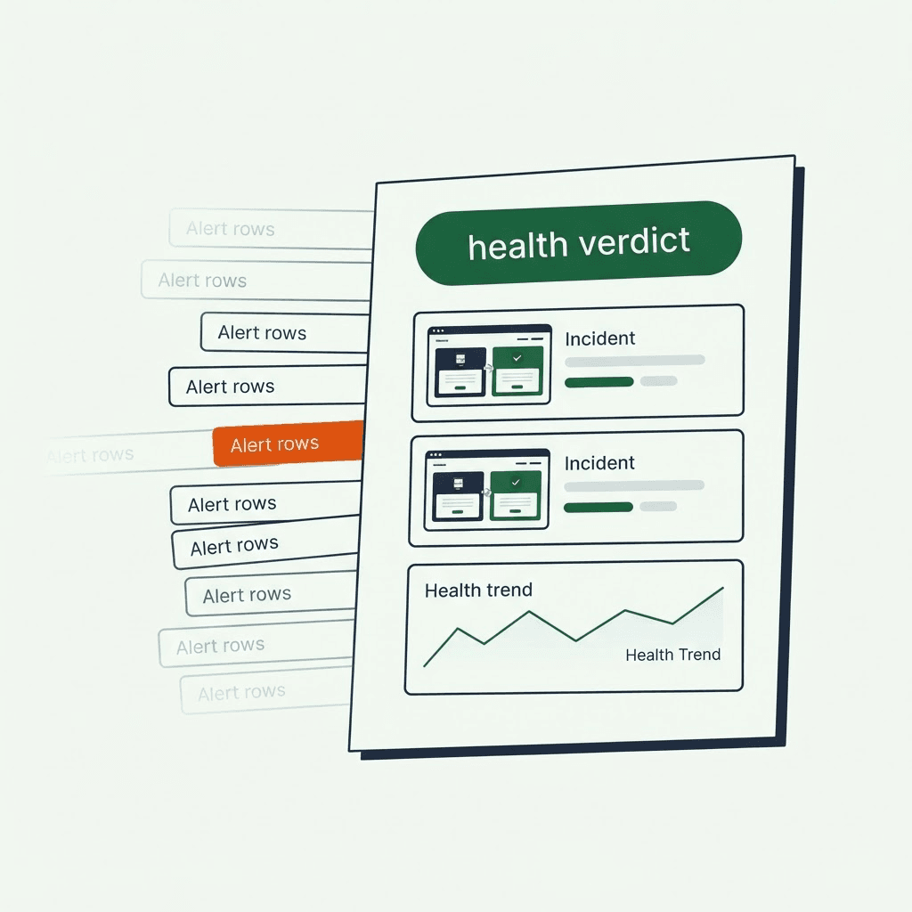
Clients ask a blunt question: is the site working? Most monitoring output does not answer it. A good monthly site health report does. It starts with a clear verdict, then explains what failed, how fast you caught it, how fast you fixed it, and whether the trend is improving or slipping. This guide shows how to turn technical monitoring data into a client-ready report that builds trust and earns the retainer.
Why raw alerts and dashboards fail with clients
Teams love dashboards and alert streams. Engineers need them. Clients usually do not. They care about business impact: can customers buy, submit forms, or find products?
Raw alerts fail with clients for four reasons:
- Noise kills context. Alerts fire for minor regressions. Clients see a wall of warnings and assume the site is always breaking.
- Jargon blocks understanding. Console errors, stack traces, and metric deltas mean little to non-technical stakeholders.
- No business mapping. An alert about a missing H1 does not explain whether traffic, conversions, or lead capture suffered.
- Weak evidence. A red status light does not show the customer experience. A screenshot or before/after DOM does.
If your monthly report is a dashboard export or an alert dump, clients will ignore it or question your value. This is the same trap that keeps monitoring from becoming a paid deliverable, which we cover in turning client site monitoring into a retainer line item.
The four questions every client report must answer
Build the report around four client questions:
- Is my site working? Start with one clear health statement for the reporting period.
- What broke? List the real incidents in plain language.
- How fast was it caught and fixed? Show time-to-detect and time-to-resolution for each incident.
- What is the trend? Show whether site health improved, held steady, or declined.
Lead with those answers. Put the technical detail in an appendix for engineers and IT contacts.
What to include in a monthly site health report
Keep the structure simple: a one-sentence summary, short highlights, incident cards, then an appendix.
- Executive summary (1–3 sentences): overall health verdict and one-line value statement.
- Coverage and scope: what pages and features you monitored, and why. Use a simple table.
- Incident highlights: plain-language summaries, impact, start and end times, root cause if known.
- Time-to-detect and time-to-fix: show both for each incident.
- Before/after evidence: screenshots, rendered HTML snippets, and short notes.
- Health trend: a simple chart such as percent of pages with failures per week, plus a short readout.
- Recommendations and next steps: prioritized fixes and tests.
- Technical appendix: raw alerts, logs, console errors, and full DOM snapshots.
Checklist:
- Executive summary (1–3 sentences)
- Pages monitored (list plus coverage percent)
- Top 3 incidents with plain-language descriptions
- Time-to-detect and time-to-fix per incident
- Before/after screenshots and short captions
- Health trend chart with legend and short interpretation
- Action items and priority list
- Technical appendix with evidence links
Example coverage table:
- Product pages | 120 | High | Covers PDP variants by template
- Cart page | 1 | Critical | Checkout entry monitored
- Contact and lead forms | 8 | Medium | Monitors submit flow
Use incident cards to make failures clear
Each incident should stand alone as a card. A client should be able to skim it and understand the impact without technical help. Use the same structure every time:
- Title (one line): "Contact form submit button missing after May 12 plugin update"
- Impact summary (one sentence): "Users could not submit the contact form on 6 landing pages, which likely blocked lead capture."
- Timeline: detected 2026-05-12 09:14 UTC, resolved 2026-05-12 11:03 UTC (1h 49m).
- Detection method: "Form CTA absence detected by a rendered browser check; screenshot captured."
- Cause (if known): "A plugin update introduced a CSS change hiding the submit button on specific templates."
- Business impact estimate: "About 200 form submissions missed based on last month's average."
- Evidence: before screenshot, after screenshot, and a short rendered HTML excerpt.
- Next steps or permanent fix: "Pin the plugin to the previous version, patch selector logic, and add a selector-based test."
A practical evidence section reads like this:
Evidence:
- Before image: 2026-05-12-contact-form-before.png
- After image:  2026-05-12-contact-form-after.png
- Rendered HTML (excerpt): <button class="submit-button" style="display:none">Send</button>
- Console errors: none
That card answers three questions fast: what failed, how long it mattered, and what you did next. The rendered checks behind those cards are the same ones in the Guard test suite breakdown, from render integrity to SEO.
Your site returns 200 OK — but is it actually working?
Guard is the monitoring technology that catches the silent failures other tools miss. KeyPages.ai is where you turn it on. Audit any URL free first — no signup, results in 30 seconds.
Run a free page auditWhat before-and-after evidence to capture
Screenshots persuade. Bad screenshots confuse. Capture evidence the same way every time.
For each monitored page with a failure, include:
- A full-page screenshot (desktop and mobile if you monitor both). Use a fixed viewport.
- The timestamp and final URL, including redirects.
- A short caption: "CTA missing from top fold after deploy."
- A short rendered HTML excerpt showing the missing element or broken markup.
- Key metadata: HTTP status, title, H1, canonical, robots meta, visible text length.
- Console and resource errors that match the failure.
A screenshot alone can mislead. A homepage capture that shows an empty banner does not tell you whether the cause was a missing image, an ad blocker, or a CDN failure. Add the screenshot, the image tag that should have rendered, and the matching network errors such as 404s or blocked requests. Use side-by-side before/after thumbnails with a one-line caption under each, and link each image to the full-size capture in the appendix.
Keep the main report non-technical
Split the audience. The cover page and incident cards should be readable by a client. The appendix should satisfy an SRE or developer.
What belongs in the client-facing section:
- Plain-language incident summaries
- Simple timelines and business-impact estimates
- One-line recommendations and ownership
What belongs in the technical appendix:
- Full rendered HTML snapshots and a timestamped archive link
- Full console logs, resource errors, and network traces
- Screenshots at multiple viewports and device emulations
- Raw alert payloads and the rules that triggered them
- Correlated deploy IDs, release notes, and rollback evidence
Automate appendix generation. When an alert becomes an incident card, bundle one archive with screenshots, HTML snapshots, and logs, then link it from the card. That keeps the main report short and the evidence complete.
Standardize reports across clients
Agencies manage portfolios, not one-offs. Consistency cuts manual work and sets expectations.
Standards to use across every client:
- One health verdict scale, used word-for-word: Excellent, Good, Attention, Critical.
- One incident card format.
- Consistent screenshot sizes and filenames.
- One fixed coverage table format for monitored pages and priority.
White-labeling checklist:
- Replace internal product names with client branding in headers.
- Gate technical appendix links for technical contacts only.
- Keep automated evidence labels neutral and skip vendor marketing copy.
Build a report generator that takes monitoring output and renders a PDF or editable document from a template. Feed it client metadata such as owner, contact emails, and SLA targets. That keeps quality high and handwork low. Deciding which pages even belong in the coverage table is its own exercise, which we walk through in which client pages you should actually monitor.
Transparency makes the retainer easier to defend
Do not hide failures behind green checkmarks. Clients do not expect perfection. They expect honesty.
Why transparency pays:
- Trust rises. Accurate reporting makes renewals easier.
- Feedback loops shrink. Evidence and timelines cut back-and-forth on fixes.
- Prioritization improves. Business impact helps clients fund the right engineering work.
Practical rules:
- Report real incidents, even small ones, if they hit business-critical pages.
- Label mitigations and permanent fixes separately. If you shipped a hotfix, say so.
- If the cause is uncertain, state the evidence and your confidence level.
For example, if a price field disappears on some product pages, do not mark it "fixed" after a UI refresh unless the root cause is resolved. Mark it: "Mitigated (revert applied), permanent fix planned."
A reusable monthly report outline
Use this as the default template. Keep the top half client-facing and the bottom half technical.
- Cover: client name, reporting period, one-sentence health verdict (for example, "Good — 2 incidents affecting critical pages, both resolved within SLA").
- Executive summary (1–3 sentences).
- Coverage and scope: page type, count, priority, notes.
- Top incidents (3–5 cards): title, impact summary, timeline, detection method, cause, business impact estimate, evidence, action items and owner.
- Time-to-detect and time-to-fix summary: average TTD, average TTR, SLA comparisons.
- Health trend: a small chart of percent of monitored pages with failures by week, plus a one-sentence interpretation.
- Recommendations and next steps: quick wins first, strategic work second.
- Appendix (technical): alert logs, full-page screenshots and HTML snapshots, console and network traces, deploy IDs correlated with incidents.
- Sign-offs and contacts: on-call and engineering contact, product owner or account manager.
Send it monthly for standard engagements and weekly for high-risk clients. You can pressure-test any client URL against these checks right now with a free Guard page audit.
Tooling helps, but the story matters
Monitoring alone is not the deliverable. The deliverable is a report a client can read in five minutes and trust. Capture browser-rendered evidence consistently, measure detection and resolution times, and report what failed in plain English.
If you use a tool that captures browser-rendered screenshots, HTML snapshots, and console errors, you can automate much of this workflow. DataJelly Guard is one example: it produces browser-rendered artifacts such as screenshots, DOM snapshots, metadata, and error signals, which make incident cards and appendices easier to assemble. It does not replace QA, and the method in this article works with any monitoring pipeline that records rendered evidence.
On your next monthly report, lead with four lines: the site health verdict, what failed, time to detect and fix, and the weekly trend. Then use the rest of the report to prove your answer.
Your site returns 200 OK — but is it actually working?
Guard is the monitoring technology that catches the silent failures other tools miss. KeyPages.ai is where you turn it on. Audit any URL free first — no signup, results in 30 seconds.
Run a free page audit